User:Rcorrigan/Sandboxing GMS Menus
Object Properties
The lower right portion of the objects list shows the properties of the active (or selected) object. The properties can be sorted using the following command buttons:
- Categorize
 – Places the properties in categories such as "Layout", "Map", and "Symbol". The options in each category relate to the category title.
 - Alphabetical
 – Displays all properties alphabetically from A–Z without grouping them into categories.
General Properties
All objects have the following properties in common:
- Location – This field present two editable numbers. The first number is the X-axis location of the object. Increasing the X number moves the object to the right. The second number is the Y-axis location of the object. Increasing the Y number moves the object down. This property can be expanded to more clearly see the X and Y numbers.
- Name – This editable field shows the currently-selected object's name.
- Size – This field present two editable numbers. The first number is the width of the object. Increasing the Width number expands the object to the right and decreasing the number shrinks the the size of the object toward the left edge. The second number is the height of the object. Increasing the Height number expands the object down and decreasing the number shrinks the size of the object toward the top edge. This property can be expanded to more clearly see the Width and Height numbers.
- Background – Clicking on the
 button in this field, the Polygon Symbolizer Properties dialog is brought up.
Map
The Insert map ![]() tool is used to place the current image in the XMS Main Graphics Window into the Layout Editor dialog. The tool is used by clicking and dragging in the Layout Editor to define the area where the map will be displayed. The editor will automatically resize and scale the image to the defined area.
tool is used to place the current image in the XMS Main Graphics Window into the Layout Editor dialog. The tool is used by clicking and dragging in the Layout Editor to define the area where the map will be displayed. The editor will automatically resize and scale the image to the defined area.
The display of the editor can further be edited by adjusting the map properties. The map objects use general properties and the follow map object specific properties:
- Scale – Adjusts the size of the image inside of the map object. Increasing this value will decrease the size of the image. Decreasing the value will increase the image size.
- Bearing – The degree away from North of the original image in the XMS Main Graphics Window.
- Dip – The angle of descent relative to a horizontal plane of the image in the XMS Main Graphics Window.
- Height – The original height of the image in the XMS Main Graphics Window.
- Width – The original width of the image in the XMS Main Graphics Window.
North Arrow
The Insert North Arrow ![]() tool inserts in the selected location a north arrow associated with a specific map object. When a map gets rotated, the north arrow changes its rotation angle based on the map's bearing angle.
tool inserts in the selected location a north arrow associated with a specific map object. When a map gets rotated, the north arrow changes its rotation angle based on the map's bearing angle.
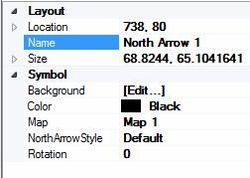
The following are the properties of the north arrow:
- Color – Contains a drop-down list of colors. Selecting a color will change the color of the north arrow object.
- Map – This field contains a dropdown list of all map objects in the Layout Editor. Selecting a map object assigns the north arrow to that map. When assigned, the arrow will rotate to match show north on the map.
- North Arrow Style – A drop-down list of north arrow styles. Styles include: "Default", "Black Arrow", "Center Star", "Triangle N", "Triangle Hat", and "Arrow N".
- Rotation – Changes the rotation of the north arrow. Normally, the arrow rotation matches the map bearing.
Scale Bar
The Insert Scale Bar ![]() tool inserts in the selected location a scale bar associated with a specific map object. The scale of the scale bar and the map controls are user-defined.
tool inserts in the selected location a scale bar associated with a specific map object. The scale of the scale bar and the map controls are user-defined.
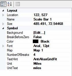
The following are the properties of the scale bar:
- Break Before Zero – Default is "False". If set to "True", the center of the scale bare will be "0" and the bar will extend out equal lengths on each side of the "0".
- Color – Contains a drop-down list of colors. Selecting a color will change the color of the scale bar object.
- Font – Displays the current font style and size for text in the scale bar object. Clicking on the
 button in this field brings up a Font dialog where the font type, style, size, script, and any effects can be selected.
 - Map – This field contains a drop-down list of all map objects in the Layout Editor. Selecting a map object assigns the scale bar to that map. When assigned, the scale bar will adjust to fit the scale of the map.
- Number of Breaks – Indicates how many interval marks will be displayed on the scale bar. Requires a minimum value of "1".
- Text Hint – Rasterization options for how the text will be rendered. Options include: "System Default", "Single Bit Per Pixel Grid Fit", "Single Bit Per Pixel", "Anti-Alias Grid Fit", "Anti-Alias", and "Clear Type Grid Fit".
- Unit – A drop-down menu where the scale bar measurement units can be selected. Units options include: "Kilometers", "Meters", "Centimeters", "Millimeters", "Miles,", Yards", "Feet", and "Inches".
- Unit text – Indicates how the units are referred to on the scale bar. Currently, this is not updated when the Units are changed.
The scale bar doesn't support geographic degrees. If the dip is not equal to 0° or 90°, the scale bar doesn't show any scales.
Text
The Insert Text ![]() tool inserts text in the selected location.
tool inserts text in the selected location.
The following are the properties of the inserted text:
- Color – Contains a drop-down list of colors. Selecting a color will change the color of the text.
- Continent Alignment – Determines the horizontal and vertical alignment of the text inside of the text object. The default is to align the text to the upper left side of the text object.
- Font – Displays the current font style and size for the text. Clicking on the
 button in this field brings up a Font dialog where the font type, style, size, script, and any effects can be selected.
 - Text – Field where the text displayed in the text object can be edited.
- Text Hint – Rasterization options for how the text will be rendered. Options include: "System Default", "Single Bit Per Pixel Grid Fit", "Single Bit Per Pixel", "Anti-Alias Grid Fit", "Anti-Alias", and "Clear Type Grid Fit".
Rectangle
The Insert Rectangle ![]() tool creates a rectangle in the location specified. Rectangles created in the Layout Editor use general properties only and do not have specific properties.
tool creates a rectangle in the location specified. Rectangles created in the Layout Editor use general properties only and do not have specific properties.
Image
The Insert Bitmap ![]() tool brings up a dialog allowing a bitmap image to be imported into the layout. This is often used for images such as a logo file.
tool brings up a dialog allowing a bitmap image to be imported into the layout. This is often used for images such as a logo file.
The following are the properties of the inserted bitmap:
- Brightness – Increases how light the image appears. Value can be from 0–255 with the default value being "0" (no additional lightening).
- Contrast – Increases the difference in color in the image. Value can be from 0–255 with the default value being "0" (no additional contrast).
- File Name – Displays the pathname and file name of the imported image.
- Preserve Aspect Ratio – A drop-down menu with the options "True" or "False". Selecting "True" will keep the image constrained to the dimensions of the imported image. Selecting "False" will change the image dimensions to fit the image object box.

